I first read about RockMelt in my newspaper. No, not in an RSS feed–in my dead tree version of the Pittsburgh Post Gazette, via an AP story announcing “Internet pioneer backs new way to surf.” The fact that I read about a new way to surf in the old media raised a flag for me. It meant either A) this revolution would be so freaking huge that the AP would be the one giving it heavy coverage (rather than say, TechCrunch or Arstechnica) or B) this was mainstream news targeted at a non-geeky mainstream audience. Either way, my curiosity was piqued, so I signed up for early access and gave it a whirl. Long story short, RockMelt will not likely change your life–and it may not even replace your current favorite browser. This is contrary to the track record of one of RockMelt’s biggest VC backers–Marc Andreesson, who gave the world Netscape Navigator. But that doesn’t change the fact that RockMelt is incredibly relevant to today’s online experience. According to the news article that brought RockMelt onto my radar, the browser is: And to that end, it does exactly what it says. The problem is that there are a lot of things that do that, many of which integrate seamlessly into Firefox or Chrome as extensions or add-ons. For the geeks among us, this is nothing new. We already access and utilize social media without roaming from one website to the next, thanks to TweetDeck, Shareaholic, TweetMeme, the Bit.ly sidebar, etc. RockMelt presents itself as an all-in-one alternative to a mix and matches grab bag of social media apps and extensions. There are advantages and disadvantages of this approach–I’ll show you what I mean as I walk you through a screenshot tour.
The first time you launch RockMelt, you’ll have to enter your Facebook credentials and give RockMelt full access to all of your data. Privacy nuts may feel uneasy about this, but there’s really no other way for a social media browser that posts updates and updates your feeds on the fly to function. RockMelt promises to never share your information with third parties, and at this stage, there’s really no point anyway, since there are no advertisements on their site or within their browser (though that’s no guarantee that there won’t ever be). Anyway, once you enter your Facebook login information, RockMelt boots up, bringing you to the landing page flanked by the two “Edges.” You’ll notice right away that RockMelt looks and feels a lot like Google Chrome. There’s a reason for that–RockMelt, is built on Chromium, so at its core, RockMelt is essentially the same as Chrome. That’s good news in terms of speed and stability. But the real secret’s in the sauce that RockMelt dollops on top of the familiar Chromium-based browsing experience. The most noticeable aspects that RockMelt brings to the party are the Edges.
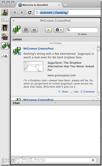
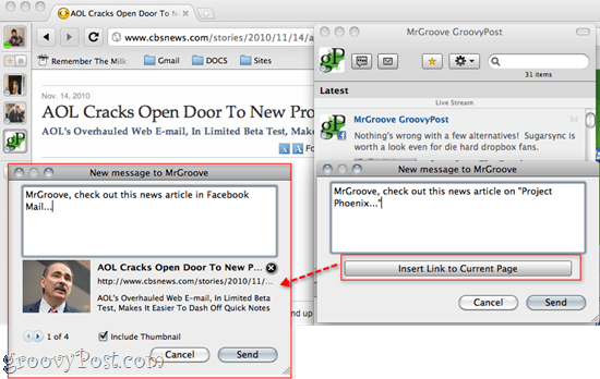
The Edge on the left-hand side of the screen is your Friend Edge, though they may as well have just called it your Facebook Edge. Here, you can see your friends as well as their chat status. Clicking on them lets you see their latest status updates and wall posts and opens up a chat window. From here, you can write on their wall or send them a message without visiting Facebook.com. One neat thing about the Friend Edge is the button that allows you to embed a link to your current page. After doing so, you can choose a thumbnail just like you would from Facebook.com. You can also choose to visit their profile, which brings Facebook.com up in the main browsing window.
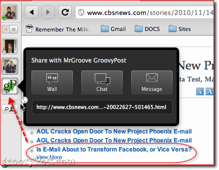
You can also share links by dragging them from the browsing window onto a contact on your Friend Edge. When you do so, you’ll be given an option to send it as a chat, a message, or a wall post.
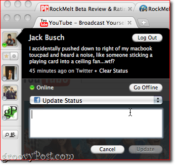
In the top-left-hand corner, you’ll notice your own Facebook profile picture. Click on it to update your Twitter or Facebook status or change your Facebook chat status.
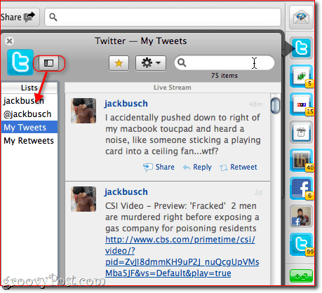
The App Edge is where your Twitter account hangs out, but it’s also a sort of amped-up favorites bar/RSS reader. Clicking on the Twitter logo pulls up your Twitter feed, which you can “tear off” (i.e. pop out) so you have a tidy little Twitter client on your desktop. If you pull open the sidebar, you can see your @ mentions and other lists. Clicking on a profile simply brings it up in the browsing window. The badges that keep track of your unread updates or tweets are also helpful (or distracting, depending on what you’re supposed to be doing at the time).
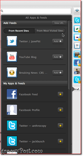
The way you get feeds into your App Edge is pretty nice. Click the Add button at the bottom of your App Edge and it’ll pull up a pane that lets you add recently or frequently visited sites by starring them. Or, you can enter the URL of a valid RSS feed. For example, when you add a blog like groovyPost.com, it’ll be given its own little icon on the App Edge, along with a badge showing your unread posts count.
When you click it, RockMelt shows you snippets and featured images for quick browsing. If you want to read the full post, simply click on it and it opens in the main browsing window.
The Share button lets you post a link to the current page you have open on your Facebook wall or Twitter account. RockMelt does all the work for you, shortening the link with its own shortening service (me.lt) and pulling up images for thumbnails if you’re posting to Facebook. One thing I really appreciate is that you can pick and choose which of your accounts to update, which is handy if you have multiple Twitter accounts.
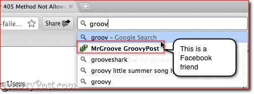
The Search Bar is also pretty interesting. For one, it not only gives you quick access to web searches but also automatically searches through your friends. You can see your results in real-time as you type. Clicking on a Facebook contact pulls them up in a torn off window, so you can chat with them, visit their profile or interact with their wall.
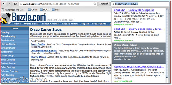
If you choose a Google Search, the results load right in a drop-down pane, saving you from navigating to Google.com in your main browser window. From there, you can click on a search result and it gets pulled up in your browser window. If that’s the one you want, simply click away from the search results and you’re good to go. If not, you can click a different search result to load that up instead. In this way, you can quickly browse through search results without hopping back and forth from the Google search engine results page. Very nice–especially since you don’t end up seeing sponsored listings this way.
Conclusion
RockMelt is very good at what it does. It puts all of your social media channels right there into your browser. That makes more and more sense these days since the main attraction to the Internet for most users is Facebook, Twitter, and a handful of frequently visited sites. RockMelt lets you spend less time navigating through web pages and more time sharing links, chatting with contacts, updating your status, and responding to your friends’ status updates. But I don’t think that RockMelt is a viable contender for Internet Explorer and Safari, or even Chrome. While the everyday user does indeed spend far more time on Facebook than any other place on the web, casual users are also the ones who are least likely to explore alternative browsers. The market share of browsers like Firefox and Chrome consists mostly of power users and geeks (by my guess) who sought them out for their expandability and customizability as much as their performance benefits. And that means that the kind of people who might check out RockMelt are the same kinds of people who already have their Google Chrome installation tweaked to the point where it does most of the things that RockMelt does. Personally, I really, really do like how easy it is to share links with RockMelt. But at the same time, it’s more important for me to have a shortening service that lets me track stats and customize links a bit more—and for that, I already have a solution. And then, of course, there’s the elephant in the room: Flock. Flock is a socially-minded browser built on Chromium, just like RockMelt. The only difference is that Flock has about a five-year head start on RockMelt. To make its mark, RockMelt is going to have to go above and beyond what Flock has already achieved. RockMelt is absolutely on the right track—this is where web browsing is heading. The way we find and share content is socially driven, and the whole notion of “surfing” is starting to seem as dusty as terms like “the Information Superhighway.” But for now, RockMelt feels to me like a bundled collection of social media extensions built into a customized version of Chrome. And like most geeks, I’d rather pick and choose my extensions and add-ons myself, rather than go with the package deal. To see how RockMelt works in action, check out the official video below: Comment Name * Email *
Δ Save my name and email and send me emails as new comments are made to this post.
![]()


