Luckily, there’s an Apple feature called Screen Time that lets you put a limit on how much you use your iPhone or iPad. This app doesn’t not only help you gain self-control, but it offers parental control.
What is Screen Time
Screen Time lets you track how much you use your device and allows you to schedule time away from that device and set limits on how much you use certain apps. To set up screen time: Go to Settings > Screen Time > Downtime > Toggle On Downtime. To set Limits on certain apps: Click App Limits > Add Limit > Select an app category > tap Customize days.
Grey Bars Screen Time
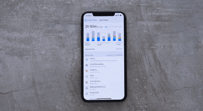
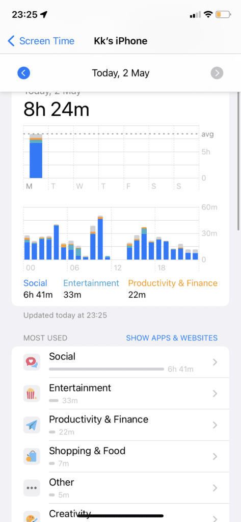
In Screen Time, you’re given a daily report on what you use on your device each day. This chart is organized mainly by categories the individual apps are broken down. Look at the image above, 1h 12m has been spent on social networks, 26m on Entertainment, and 4 minutes on Other. At the top of the bars, you’ll see grey bars. The grey bars in the Screen Time report are a combination of the category apps that you barely use on your iOS device and because they’re not used frequently, their individual category isn’t shown in the Screen Time report. For example, when you click on See All activity to see the report, click on Show Categories. As you can see in the bars, there’s a blue, turquoise, and orange color, then there’s the grey bar. The blue turquoise and orange sections in the bar represent your top 3 most used categories. So in my case, the blue represents Social Networking which is my most used category, the turquoise represents Entertainment which is my second most used category, and the Orange represents Productivity and finance. Every other category that isn’t in the top 3 most used categories will be represented by the grey color. Any category used in the grey bar can’t have its own separate color because it wasn’t used that much. There will be too many colors if each category has its own color for the bars in screen time. Plus because you don’t even use these categories that much, it’s pointless showing you significant data about it. This is why the least used categories are all represented by the gray bar. To see what these grey bars mean, click Show Categories. Under Most used, you’ll see a list of your most-used categories. For example, you’ll see Social Networking, Entertainment, and Other. Below Other, you’ll see other smaller categories that are too small to be shown in the report, these are the categories the grey bars consist of. This can be productivity, Reading & References, and Creativity.
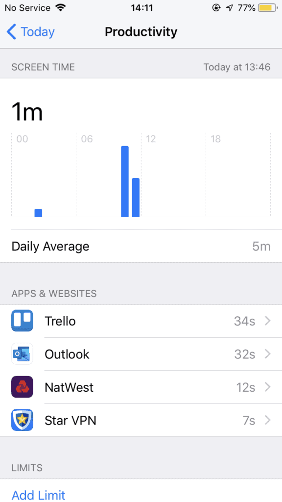
To see the apps that the Grey bars consist of instead of the categories, click on all the categories below Other. This will show you all the apps that make up the grey bar in your Screen Time report. For example, in Productivity, there can be email and banking apps. Your report will be different but be aware that there are 9 different categories on Screen Time:
Social Networking Games Entertainment Creativity Productivity Education Reading & Reference Health & Fitness Others
Each of these categories could end up being represented by the gray bar if they’re not in your top 3 most used categories. For example, if you don’t use any apps in the reading and reference category, it’s going to be part of the categories that are in the gray bar – simply because you don’t use it as much as it’s pointless for it to have it’s own separate color since the size of will be so small you won’t even be able to see it. If you ever get to the point of using a category in the gray bar that it becomes your top 3 most used categories, then it’ll no longer be in the gray be. If it’s third, it’ll be the orange bar. If it’s the second most used category, it’ll be the turquoise bar. If it’s the most used category, it’ll be the blue bar.
Find Out Which Categories Are In The Gray Bar
If you tap on Show categories underneath the grey bars, it’ll show you your most used categories. From here, every category below the third category will be a category that’s included in the gray bar. Within these categories, you’ll be able to see which apps are responsible for how much screentime you’ve spent on these categories. If for whatever reason you want an app to get out of the grey category and move into one of the main categories, you can do this by using the app more. Using the app more than the top 3 current most used categories will force it out of the gray bar and move it into one of the colored bars.


